Relating words and pictures, Part 2
Relating type to image The first step in developing a type and image relationship is recognizing that type and image are fundamentally different languages. The challenge is to develop similarities so that two different things look like one single thing. Anyone can design a thing, but to design a good thing takes the ability to find and exploit relationships.
The second step is deciding whether the type or the image will be dominant. The image, as a default “non-decision,” is usually dominant. Dominance ordinarily refers to quantity: one element dominates when it is the largest thing in a design. But dominance can also occur when one element imposes itself on another element. A subordinate element is one that is imposed on by another.
The third step is to create the relationship, to design the parts so they look like they belong together. There are three basic relationships, with an infinite number of ways to execute them:

- Relate by position or proximity Things that are closer look more related than things that are further apart. The ultimate nearness is on top of, so layering is an ultimate expression of proximity. Image on top of type makes the image look more real by adding implied depth (but if too much type is covered, it makes the type hard to read). Type on top of image is much less persuasive (and it negates the reality of the image and makes small type hard or impossible to read).

- Relate by size or alignment When the height, width, or starting and ending positions of the image is equal to the type, they are unified. Coincidental agreement is not as persuasive as cutting off part of the type to make it match the size of an image.

- Relate by shared form or characteristic treatment, direction, color, texture, or idea This is a huge category. One example may suffice: if both the headline and visual are white, reversed out of the image, and hand drawn, they are perceived as being unified.
Shared form Form is another word for anatomy, appearance, arrangement, configuration, fashion, guise, manifestation, shape, species, style, or structure. From these myriad (from the Greek for ten thousand) choices, when we talk about type and image sharing form, we’re talking about getting them to have the same shape.

- Shape can be defined as bringing design treatment, direction, color, texture, idea, or one of dozens of additional attributes into agreement. One such is treatment: whatever you do to the headline you do to the image. Bend both. Put one into the other. Rather than letting them look like they just happen to be on the same page — with maybe a nice alignment to make them look designed — type and image should be caused to relate. Type may be placed on a surface in the image, they may share a shape, or the image may be altering the type.

- Direction Direction is inherently dynamic. Emphasizing one direction over any others avoids static balance.
Our natural tendency is to look from top to bottom, and from left to right. Working with direction in any other way is fine, so long as you anticipate a subconscious barrier from your readers. Make your atypical directions apparent and worthwhile. Direction may be vertical or horizontal, or diagonal in two or three dimensions.

- Color can be extracted from the image and applied to the primary type, making them unified. Or color can be contrasted to create relationship. The most natural color contrasts are complementary colors, colors that are opposite each other on the color wheel.

- Texture is a surface that is described by touch. In two dimensional design, a feelable surface must be translated into a visual description. Such a translation of texture is often mistaken for pattern, which is a repeated decorative design. Actual texture is so uncommon in advertising that it alone, as on an insert or package, can demand attention.

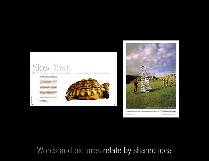
- Idea By far the most interesting way to create design unity is through concept. The opportunities for making the message its most potent are the greatest in this category. However, the results are dependent on the thorough blending of visual materials.
