Design transparency: The Ayers №1
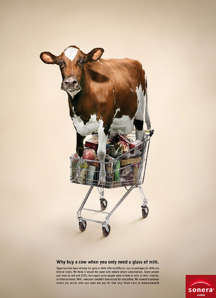
Design transparency: the Ayers №1 is the simplest, most transparent form to give an advertising message. It shows a picture, a headline, and the lesser elements in their naturally descending order. The Ayers №1 is the most invisible, unselfconscious presentation of information possible.
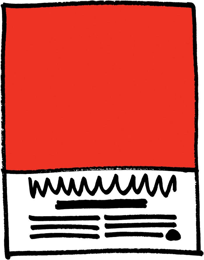
Another benefit of the Ayers №1 is that readers are used to it, so they look through the presentation of the content to the content itself.
The weakness of this format is, of course, that it makes your ad look very much like everybody else’s Ayers №1 ads. The remedy is to give your ad a twist:
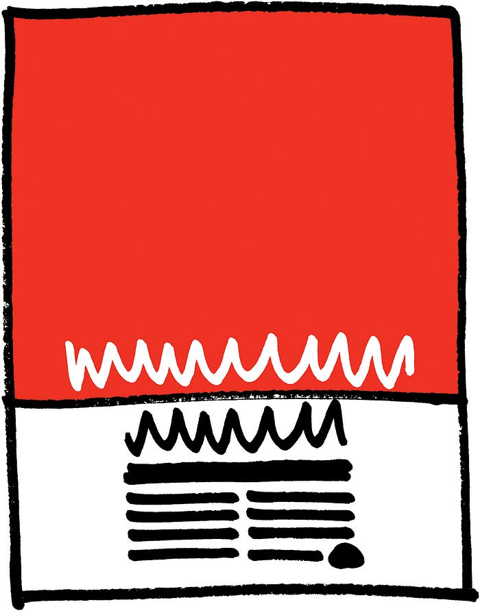
Run the headline into the image so it acts as a bridge between the picture and type areas.
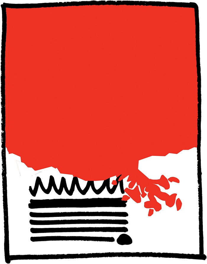
Cut the image off in a silhouette rather than a horizontal line.
- Overlapping the image in front of the type adds dimensionality and realism.
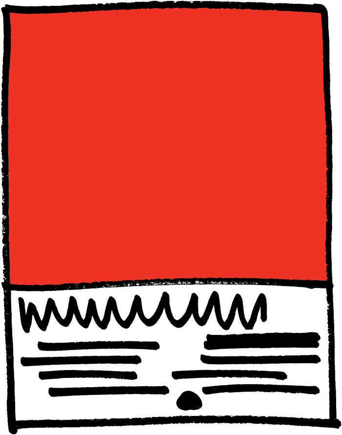
Position the type free form or asymmetrically.

Put a secondary image in the type area. Be sure the two images are significantly different in size so the large one clearly dominates.
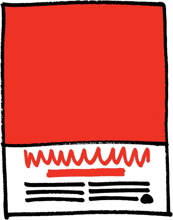
Put a texture from the image into the type area. Or relate the image to the headline by shared treatment. Or ghost the primary picture very lightly and put it behind the type area.
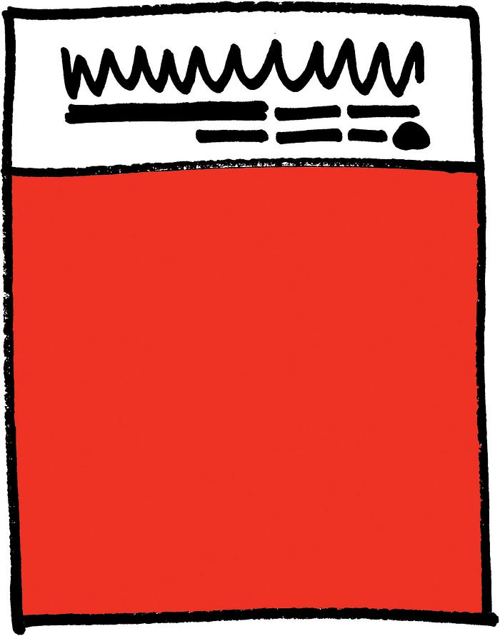
Make an upside down Ayers №1 with the headline and text at the top and the image at the bottom. It works nearly as well as right side up.

Put the headline and text sideways in the type area. This is especially effective when the image has two meanings: one horizontal and one vertical.
Just about anything can be done without harming the Ayers №1 format. The most defendable decision you can make is, naturally, the design treatment that furthers the existing branding style. The Ayers №1 is so versatile, it’s like vanilla ice cream: you can pour anything on it and it will still taste great.
Other formats draw attention in their own idiosyncratic ways, but the Ayers №1 will be here forever, transparently letting the idea come through — and winning awards for copywriters and photographers, but only incidentally for designers and art directors.
